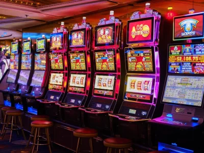


Ever wonder why you’re drawn to certain slot games almost instantly? It’s not just the promise of a jackpot. Honestly, a huge part of that magnetic pull happens before you even hear the first spin. It’s all about the colors. Slot game developers are, in many ways, master artists and psychologists. They wield color theory like a secret weapon to create moods, trigger emotions, and—let’s be real—keep you playing.
Here’s the deal: our brains are hardwired to respond to color. Red can get our heart pumping. Blue can make us feel calm. Gold screams luxury and wealth. Developers know this. They use it. Every hue on the screen is a deliberate choice, a calculated part of the player experience. Let’s dive into the vibrant world of slot design and see how it really works.
The Psychology of Color: It’s More Than Just Decor
At its core, color psychology is the study of how different shades affect human behavior and decision-making. For slot developers, this isn’t some abstract art class concept. It’s a critical tool in their design toolkit. They aren’t just making the game look pretty; they’re building an atmosphere.
The Heavy Hitters: Red, Gold, and Blue
Certain colors carry a ton of weight in the casino world.
- Red: This is the color of energy, excitement, and danger. It’s urgent. It’s passionate. You’ll often see it used for ‘WIN’ banners or bonus symbols to create a jolt of adrenaline. It literally increases your heart rate and can make a game feel more fast-paced.
- Gold & Yellow: These are the colors of the sun, of gold coins, of treasure. They instantly communicate wealth, success, and optimism. A gold coin symbol feels more valuable than a grey one, right? It taps into that deep-seated desire for riches and luxury.
- Blue: Blue is the counterbalance. It’s calm, trustworthy, and stable. Developers use blue backgrounds or interfaces to create a sense of security and relaxation. It makes players feel comfortable enough to stay for a longer session, which is, well, the entire point.
Creating a Mood with Color Palettes
It’s not just about single colors, though. It’s about the whole palette. A game with an Egyptian theme will lean heavily on sandy yellows, deep blues (like the Nile at night), and rich blacks to feel ancient and mysterious. A fantasy-themed slot might use purples, magentas, and shimmering silvers to create a sense of magic and the unknown.
This careful selection is a form of visual storytelling. It sets the stage before a single symbol lands on the reel.
Guiding the Eye: The Functional Magic of Color
Beyond emotion, color has a brutally practical job: directing your attention. A screen is a busy place with reels spinning, numbers flashing, and buttons blinking. Developers use color contrast to cut through the noise and tell you exactly where to look.
Think about a ‘SPIN’ button. It’s rarely a muted pastel. It’s a vibrant, high-contrast color that stands out starkly from the background. It’s an action button, and its color screams “CLICK ME!” Similarly, important symbols—like wilds or scatters—are almost always designed in colors that pop against the other, more mundane icons on the reels. A bright red wild symbol is impossible to miss.
This visual hierarchy, built on color, ensures you never miss a win or a bonus trigger. It makes the game feel intuitive and rewarding.
Building Trust and Brand Identity
You know a Pragmatic Play game when you see one, don’t you? Or a Blueprint slot? A big part of that recognition is their consistent use of color palettes and art styles. This is crucial. In a sea of thousands of games, developers need their titles to be instantly recognizable.
Using a consistent color scheme across their portfolio builds brand identity and, more importantly, trust. If a player has a great experience on one game from a developer, they’re more likely to try another. That familiar color palette acts as a subtle signal of quality and a known quantity. It’s a smart, long-term play for player loyalty.
The Dark Side of the Rainbow: Responsible Gaming Cues
This is where it gets really interesting. Honestly, the industry is under more pressure than ever to promote responsible play. And color plays a role here, too. While the game itself is designed to be engaging, menus for reality checks, deposit limits, and time-outs are often designed very differently.
They typically use neutral, calmer colors—blues, greys, greens. The frantic energy of the main game is deliberately stripped away. The buttons might say “TAKE A BREAK” in a soft blue instead of a fiery red. This color shift is a deliberate psychological cue to help a player step out of the excited state and make a more considered decision. It’s a small but important use of color theory for player well-being.
A World of Color: Theme-Specific Strategies
Let’s break down how color choices directly support popular slot themes.
| Theme | Common Color Palette | Psychological Goal |
| Ancient Egypt | Sandy yellows, deep blues, black, turquoise | Evoke mystery, history, and buried treasure. |
| Asian Prosperity | Reds, golds, jade green, black | Signal luck, fortune, and cultural richness. |
| Underwater Adventure | Blues, aquas, purples, shimmering silver | Create a sense of calm depth and hidden wonder. |
| Fruit Machines (Classic) | Primary reds, bright yellows, greens | Trigger nostalgia and simple, straightforward fun. |
The Next Time You Spin
So, the next time you load up a slot game, take a second. Just look at it. Notice the colors. What are they trying to make you feel? Energetic? Relaxed? Curious? That pull you feel isn’t an accident. It’s the result of meticulous design, a clever blend of art and science aimed at crafting an experience.
The canvas of a slot game is a psychological landscape, and color is its most powerful language. It’s a fascinating, almost invisible force shaping every moment of play—from the first glance to the final spin.